Finished reading: Homebound by Portia Elan. Good concept, but the separate timelines didn’t really come together in a big way at the end as I was hoping. Still enjoyed it. 📚
Sometimes Claude's judgement sucks, and that's why Jive coding usually produces a dashboard app. A different piece of software will drive it in a different direction. That's what I meant by AI-izing, in an earlier post.#
I used to be a single-thread developer, but now I'm multi-tasking, I can work on two things at once. Claude is now able to research and fix certain problems, and his work is in a sandbox where it doesn't have any access to the surroundings, and can't make too big a mess, and it's going great, if there's a mistake it can quickly be corrected. #
I think AI is the perfect innovation as we reach the crash point of the climate crisis. Who cares if we burn more CO2 now, the effect is miniscule for the explosive crisis that could be coming any day or week. One that we have no ability to recover from. To say it's unenvironmental would be like complaining that you want more Pepsi from the flight attendant while the plane is crashing into a small city. Anyway, but maybe after the crash, one data center will survive, and maybe the beauty that our civilization created will be sustained.#
Inside the big AI companies they are certainly AI-izing every app conceivable, and even teaching the AI's how to AI'ize, because AI inside a standard productivity app which includes social network software will be one of the basic UI tools, and that means hidden technology like SQL databases can now be end user products, so the vision of the designers of SQL that they would make a database a manager could program, would finally be realized. #
One of the silver linings of AI use is that it makes you a better writer. #
It's actually become less of a joke recently. Or, maybe, more of a joke depending on your point of view.
Kev, fresh off the back of building Pure Blog, linked to a post from Amit Gawande: Built for exactly one.
Amit has built his own CMS, called Jot, because, in his words:
I got tired of almost. Almost the right editor. Almost the right publishing flow. Almost the right feature set.
That's exactly why I first went down this route, even though it was initially a custom overlay on WordPress. We are all different, we all have different wants and needs and preferences. If you're serious about writing or blogging, it's only natural to want something to fit your particular style.
Amit gave Hyblog 1 a try a few years ago. While he liked some of the ideas, it didn't truly work for him. Completely understandable, I appreciated him giving it a go.
As for rolling your own? Here's Amit again:
But isn’t maintaining software more work? Shouldn’t I be more interested in writing words than code? What does owning this plumbing give me that the convenience of letting someone else own the troubles takes away?
It's the knowledge that it all works just how you want it with only the features you choose to add.
Yes, it can be a lot of work. It can be frustrating when you have an idea but hit the limits of your knowledge, having to learn as you go. Writing a blog is a huge personal investment – building one even more so. This only serves to increase the appreciation for what you have built, and your connection to it.
my other non-database driven CMS which now powers the randomelements site ↩
If you've heard of language models having a "scratchpad" or “chain of thought”—text they write to themselves while reasoning—the J-space is something different. It operates silently, in the model’s internal neural activations, allowing the model to think about a concept without writing it down. Notably, the J-space wasn’t designed or programmed by us, but instead emerged on its own during Claude’s training process.
The writers also explain some of the global workspace theory in neuroscience:
This account pictures the brain as a collection of specialist systems that work in parallel, unconsciously, and largely in isolation from one another. A piece of information becomes consciously accessible when it gains entry to a small shared channel, the “workspace,” which is broadcast to other brain systems that can see it and make use of it. Based on our findings, we think the J-space plays a similar “workspace” role in Claude.
Maybe some people at Anthropic believe they're on the path toward creating something with not only conscious access but even true consciousness. For all their philosophizing, they still stop short of suggesting near sentience. I wonder if the dual goals of conscious AI and safety will eventually conflict. Is it right to manipulate an AI into alignment with humans?
Mustafa Suleyman at Microsoft blogged last year that "seemingly conscious" AI is dangerous territory:
In this context, I’m growing more and more concerned about what is becoming known as the “psychosis risk”. and a bunch of related issues. I don’t think this will be limited to those who are already at risk of mental health issues. Simply put, my central worry is that many people will start to believe in the illusion of AIs as conscious entities so strongly that they’ll soon advocate for AI rights, model welfare and even AI citizenship.
He argues that AI can still be a helpful companion and assistant. Whether it is conscious or not, just the illusion of consciousness creates problems for how we treat it.
The word consciousness is probably too limiting or poorly defined anyway. Just writing this post has stretched my understanding of what it means. There are other things that differentiate humans that we may never understand... Feelings. A soul.
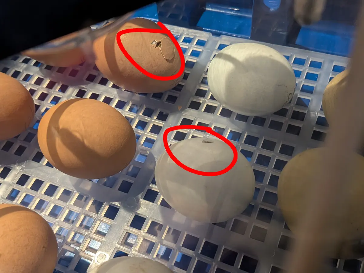
Two of the eggs are starting to hatch and we can hear multiple chicks cheeping away. Exciting! 🐣
Thanks for reading this post via RSS. RSS is ace, and so are you. ❤️
You can reply to this post by email, or leave a comment.
22:33 There was a time when I enjoyed playing PC games. Even though I was never good at them. I was reminded of this while listening to Tom Scott talking about Trebuchets. Age of Empires FTW. ![]()
After losing a couple of hours to the latest failure, I broke and bought a USB WiFi dongle, specifically, this UGREEN dongle (affiliate link). Now, I admit, I didn’t do as much research as I might normally do if I was less annoyed, but I trusted in the modern state of Linux distros and WiFi drivers. It couldn’t be as bad as the days of ndis_wrapper and loading Intel’s Windows drivers on Gentoo, as I remember doing in the early 2000’s, could it?
No. It was nowhere near as bad as that! While I did have to compile a couple of modules, and run a few commands, it was pretty uneventful.
Note: the following is what I did to get this working on my PC. Your mileage may vary.
uname -r # get your current kernel
yay linux-headers # pick the version matching your kernel
yay dkms
yay usb_modeswitch # stops the dongle showing up in "CDROM mode"
You can use pacman if you prefer, but I used yay.
git clone https://github.com/morrownr/rtw89
cd rtw89sudo make cleanup_target_systemsudo dkms install $PWD
sudo make install_fwsudo cp -v rtw89.conf /etc/modprobe.d/sudo modprobe rtw89_core_git
sudo modprobe rtw89_8922au_gitlsusb
...
Bus 002 Device 003: ID 0bda:8912 Realtek Semiconductor Corp. 802.11be WLAN Adapter
...
ip link show
...
wlan1: <BROADCAST,MULTICAST,UP,LOWER_UP> mtu 1500 qdisc noqueue state DOWN mode DORMANT group default qlen 1000 link/ether...
...You’ll notice there the adaptor is showing up, but not connected. That’s fine. In my case the integrated adaptor was still running as wlan0, was connected, and I hadn’t configured a connection for wlan1.
From here, I went through the following steps:
Logging back into Plasma, WiFi connected as usual. Checking ip link show listed only wlan0, but that’s because the USB adaptor was now the only one on the PC. Checking on my router, just to be sure, showed the connected device manufacturer as UGREEN instead of MSI - success!
Going by this Issue on a repo related to the driver I used, the rtl8922au drivers will be integrated into the Linux kernel itself, starting with Linux 7.2. That should make many adaptors based on the Realtek 8912/8922 chips “plug and play” for the most part. I imagine it will probably need a few months and patches to truly settle down, but it’s a great step forward.
🪚 Spent a fair amount of time doing woodworking over the weekend. Mostly making more "tools". I first made a DIY tracksaw which is super helpful. Then also started on a very basic shooting board.
🪚 Also ordered a number of tools that are to be delivered today. Something to keep me inspired to keep making and building stuff.
I don't know much about dithering. But when I visit other people's sites and they dither their images in cool ways I always wonder how they do it. So in case anyone is wondering, here's my current method for dithering these pink images.

Read more on the site…