2022/05/10#p1
In a comment yesterday I mentioned that I had more ideas for the site. One of them has already come to fruition.
In addition to being simple and minimal, I have designed (b)log-In to be consistent, to operate in largely the same way whether it be the blog, journal or notes sections. Anywhere I write I follow the same steps and the text is processed in the same way.
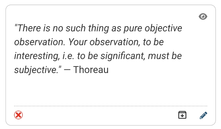
Different areas have slightly different design language but there remain some consistencies like reader, labels, start and notes all using variations on a card based look. Here's a note:

Reader introduced a different paradigm with the list of feeds being in a tray that slides in from the side of the screen allowing the content to take centre stage. With my current focus on stripping things back I thought this might be a good idea for the rest of the site. The menu in the footer has been growing and looking a bit messy so could a tray help here?
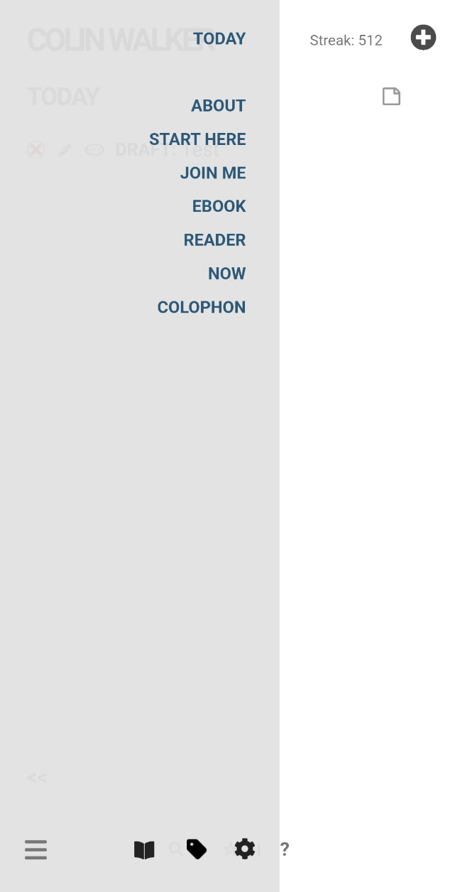
The result? Text menu items have been moved into a site-wide tray triggered by a menu button bottom-left, just like on Reader:

The admin links (Admin, Labels, Dictionary) have also been relocated to the tray while the footer itself has been drastically simplified with only the three icons left:

I may rework the items in the tray and change their order but am extremely happy with how this has worked out. Because I already had a separate footer file the changes were pretty quick to implement after initial testing.
It's another iteration to be added to the site history

