Blogging through time
While I have been active on the internet in one form or another since 1993 1 I got 'online' properly in 1995 and spent a lot of time in various forums or on ICQ and IRC. In the late 90's I started noticing blogs and became a frequent reader and commenter. By 2003 I decided it was time to have my own blog. As I was working in outsourced support for Microsoft UK at the time it seemed natural that my first blog was a mixture of personal updates and what I was learning about various Microsoft technologies.
Kev Quirk recently gave a design history of his blog prompting others to do the same, so here's mine.
2003 – Now this is how it started
Through my job I had full access to an MSDN account and had been looking at various Microsoft server products. It was, therefore, no real surprise that my first blog was built on SharePoint. That's right, SharePoint! It wasn't designed for it, required a lot of tweaking and custom code but it worked... Mostly. In June 2003 I first registered the domain randomelements.me.uk and launched a blog using SharePoint Portal Server.
The first capture on the Internet Archive is, sadly, from 10th March 2004 but the look hadn't change much since launch.
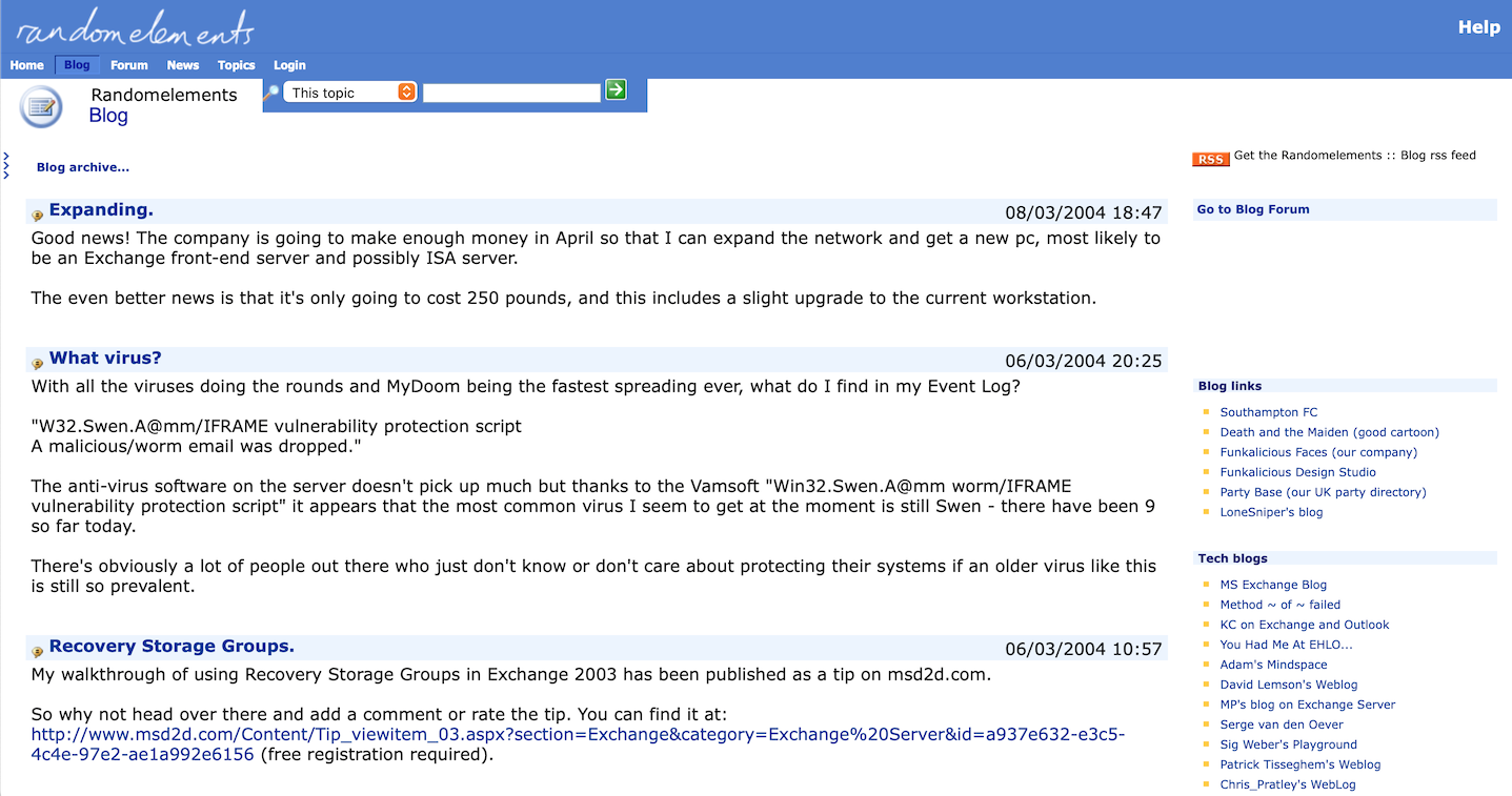
I had a static IP from my ISP at the time so was self-hosting this and an Exchange Server on a machine in my dining room.
SharePoint wasn't supposed to be a blogging platform and a lot of customisations had to be made to make it viable. RSS feeds were not supported out of the box but a clever chap called Sig Weber created an add-on that generated feeds for SharePoint lists. I also took and rebuilt an open-source ASP forum, integrating it into the site using iframes. The forum doubled as the mechanism for making comments using some SQL tricks.
2006 – One SharePoint to another
In 2006 I switched from SharePoint Portal Server to Windows SharePoint Services v3. Things were more streamlined with WSS and the site looked more like a blog than before. There was now an RSS feed for comments as well as posts, and even a mobile view using WAP.
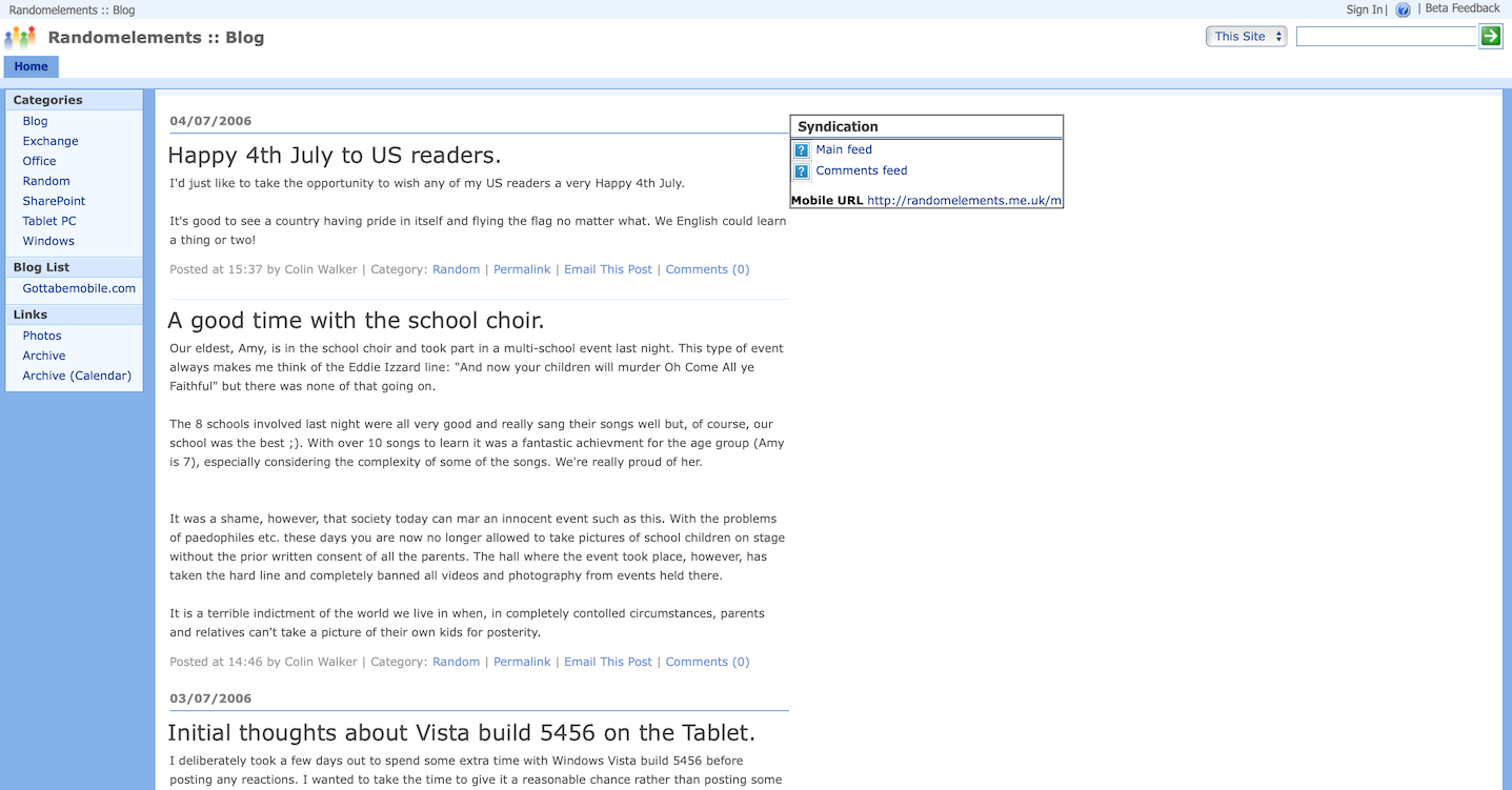
Changing sidebar widgets aside, that's how things remained for almost the next two years. Over time I became disillusioned with SharePoint. While I had managed to make it a reasonably functioning system I'd reached the limits of what it was capable of. I had mostly switched my blogging focus to social media and was looking for better integration with the social web. My wife had been trying to get me to use WordPress for a while and I finally succumbed.
2008 – Welcome WordPress
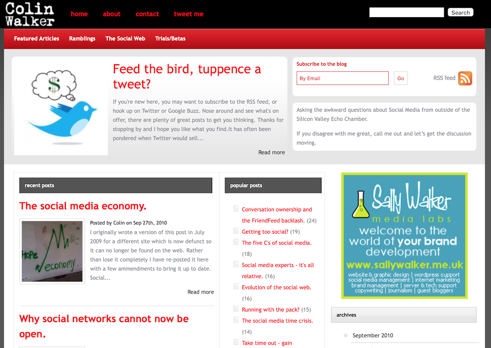
While I had been essentially microblogging since 2003, with the occasional longer post, the change saw me try to be a citizen journalist. I fell into the trap of writing mainly essay style posts and wanted a theme that would look more like a news portal, emulating the tech blogs rather than a personal blog. By complete contrast I decided to change to a personal domain and registered colinwalker.me.uk.
Gone was the blue of SharePoint in favour of red and black, multiple columns and 'read more' links. In retrospect it's not something I'm overly proud of but I was trying to be something I wasn't. I took the first of numerous blogging breaks in 2009 and the domain redirected to a wordpress.com version which may be why the Internet Archive again failed to properly capture the site until October 2010.
2011 – Rebrand
Towards the end of 2011 I rebranded the blog to 'Social Thoughts' instead of just my name but, in the short term, not much else changed. Over the next few months I slowly simplified things and the site evolved. I cut out a column and made it lot lighter, more whitespace; the red stayed but was dialled back a bit.
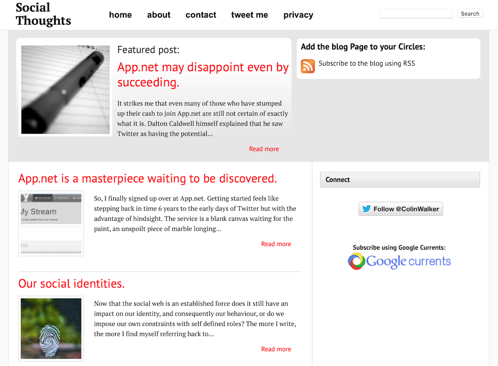
In keeping with the name I had also decided to re-include shorter posts or 'thoughts' as I would call them to match the site name. I had been running a separate 'blogette' on Posterous called 'Colin's Thoughts' which focused on shorter, quicker, less essay style posts and it seemed a good opportunity to combine the two.
I was heavily active on Google+ which prompted a number of design choices like the inclusion of G+ comment sections and direct links to subscribe in Google Currents while it was still a news reader app before becoming the rebranded Google+ for business.
2012 – Stripping it back
By the end of 2012 I had continued cutting back and embraced a more minimal approach. I think I had realised the previous error of my ways.
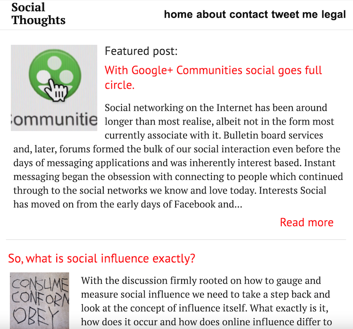
The site had been cut back to a single column with no sidebar. Links were still red but the site was otherwise monochrome with a lot of whitespace, things felt much more airy. Posts were mainly essays with the 'thoughts' becoming less frequent. I was becoming jaded with constantly striving for perfection on the blog and switched full time to Google+ in November 2013.
2016 – Blogging back better
By the end of 2015 I had stopped writing on Google+ as a number of changes, and a shift in the community, made me realise it couldn't really replace your own site, but I still wasn't quite ready to return to the blog. It took until March 2016 for me to reboot the site. The first capture in April illustrates a shift in design to go with a shift in content. I wanted to write a lot less about social media due to an increasing frustration with life on social networks.
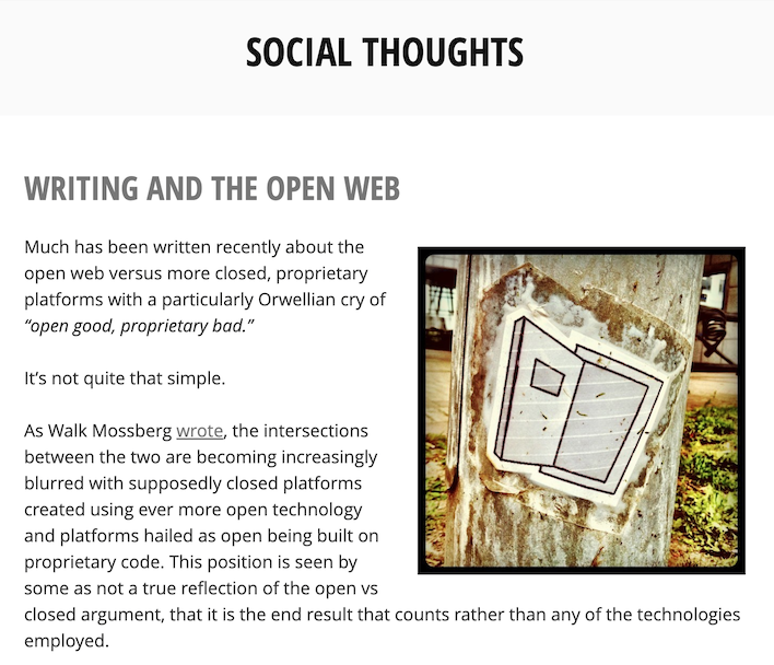
I made a deliberate decision to become even more minimal and move to grey scale, the red had finally gone along with the 'read more' links, full posts on the home page was the way to go instead of having to click through.
There was, again, a period of gradual evolution. A few months later saw the change to the blue/grey colour for links - completely monochrome wasn't working but I didn't want too much colour. The default link colour in (most) web browsers is blue so I wanted to reflect that but remain more muted.
Strangely, a couple of months later I had reverted to the grey and reintroduced the 'read more' links along with social buttons. What was I thinking? I was more active on Medium and had outsourced comments there, disabling native WordPress comments to avoid having to deal with spam. It seemed like a good idea at the time...
2017 – Big changes
In January 2017 I stumbled across the kickstarter for micro.blog. Having stopped using Twitter in December 2016 this piqued my interest and in February I started prepping the blog to better integrate with the service and provide a better venue for hosting my own microblog posts. This also had a big impact on the way I posted – I returned to how things were from 2003 - 2008 with predominantly short, micro posts and the occasional longer effort.
Around this time I also switched to the colinwalker.blog domain
The first half of 2017 was a period of massive change. I originally felt that the microblog should be separated from longer posts but relented when it seemed counter-intuitive to do so. Threads and themes would go between long and short posts so it became hard for people to follow along if only following one RSS feed.
Micro posts integrated with longer items as seen here.
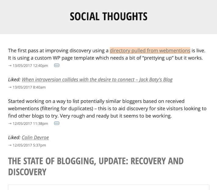
Some of the more familiar design elements from later iterations of the site started to creep in such as the the little icon to show if there were comments on posts. Visually, it was another case of gradual evolution; technologically it was taking huge leaps as I began integrating IndieWeb elements and plugins into my theme and WordPress.
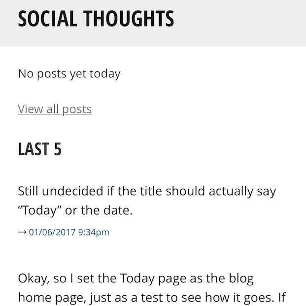
In June 2017, inspired by Dave Winer's Scripting News, I made what was probably the most fundamental change to the site which has defined how it looks and works ever since. I changed the homepage of the blog to a "Today" page with posts in chronological order. You would start the day at the top and read down in time order – top to bottom just like reading a book. If there were no posts for that day it would say so and list the 5 most recent posts. There are no working captures on the Internet Archive for this period but the below shows how it looked on mobile:
I was initially worried about the change as people are so used to reverse-chron but it stuck and I have kept with it ever since. The rest of the year saw me refining the design, permanently reintroducing the blue/grey for links. I had toyed with trying different colours to make them stand out more (especially when using my phone in greyscale) but decided the blue was best.
2018 – Rebrand and revert
By April 2018 I reverted to calling the blog by my name rather than the 'Social Thoughts' moniker which no longer fit my approach. The option of a dark mode had appeared by way of clicking a dot at the top right of the page.
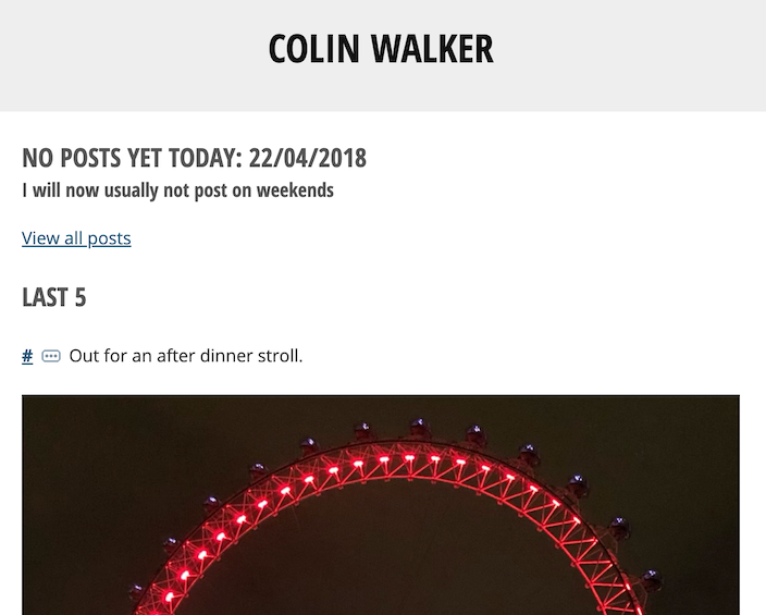
By July 2018, after going on holiday and being largely disconnected, I decided that I needed to step away from online life for a while – cue another blogging break. On my return in 2019 I started further simplifying, reducing, decluttering. Here's a capture from May 2020 (again, captures are very spotty.)
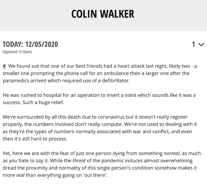
Over time the 'Today' page had moved to a "blank slate" metaphor; I stopped linking to previous posts so if there were none that day there would literally be nothing to see, each day a blank slate, a fresh start. The blog had hit peak minimal. Each day became a single post that I would continue to edit throughout the day and divide into sections. To start a new section I would type two ampersands which would get converted to a linkable hash at display time. I created a custom RSS feed that would take each section and present it as a separate item but recommended people used the Daily Feed to catch up with everything in one go, top down like on blog.
November 2020 also saw the birth of The Garden, my own digital garden/wiki style repository where I could store things that weren't posts. Each item was a WordPress page within a hierarchical structure (parents, children, grandchildren) and I could use typical wiki markup (double square brackets) to link between pages.
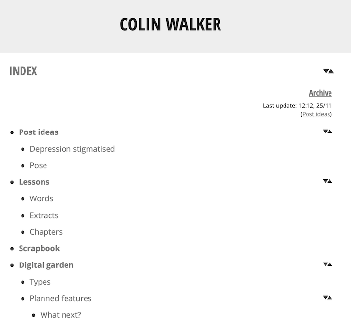
2021 - (b)log-In
Although I saw it as my ideal setup, the new mechanism lasted for just over a month. I was becoming increasingly frustrated with WordPress feeling it too heavy for what I was doing so looked at building a new version of the Today page that was straight up PHP, no WordPress. It pulled the posts from the same database but was considerably more lightweight. I realised I wanted to turn it into a fully self-contained system so built one – it was launched on the 6th Jan 2021.
I emulated the theme and layout from my custom templates in the WordPress version of the blog; I liked the look that had evolved and wanted to retain it.
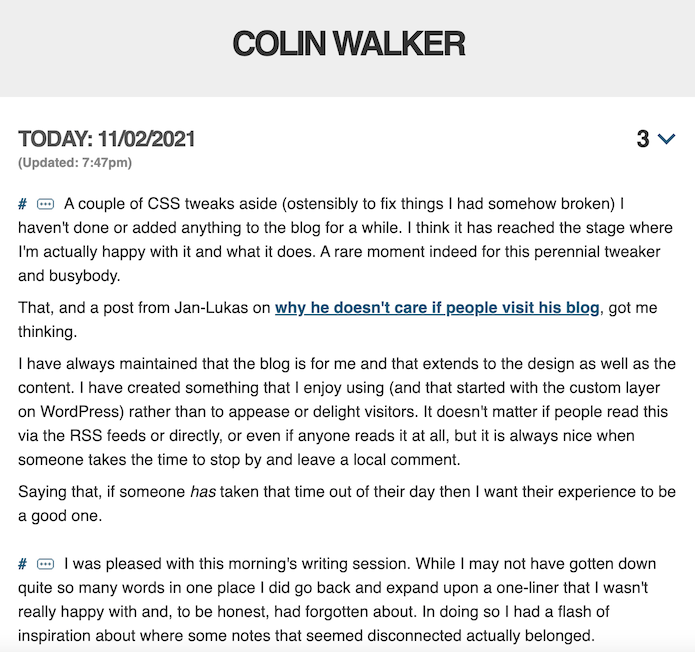
Each instance of the blog has had an ongoing process of evolution. From 2008 to 2016 it was the same WordPress theme just constantly reduced and butchered. 2016 to 2021 was my custom version of Automattic's old Minnow theme reduced to one column and tweaked. (b)log-In continues to benefit/suffer from this process - constant tweaks, borrowing bits from other people and integrating them in a way that feels natural to the site, it's all a remix.
Ups and downs
It's been fun taking a walk down memory lane but a little cringeworthy at times thinking back to some of the decisions I made or, rather, why I made them. Thanks to Kev for the prompt.
There have been a lot of ups and downs over the years with a number of breaks from blogging, both completely and by switching to write elsewhere (Google+ and Medium) but I have always come home. I sometimes regret writing away from the blog but remember that I needed to shake things up. If I hadn't, the possibility is that I might have stopped blogging completely and not returned from one of my breaks.
Things will, no doubt, continue to morph and develop over time (the recent additions of the 'Start Here' page and feed reader are testament to that) and it will be a fun experiment to see how they have changed in another 19 years, presuming blogging is still a thing.
-
first sharing music samples on a Usenet board over a 2800 baud modem – speedy! ↩


All mine have been taken but good to see others also sharing 👍