# Having let the move goal on the Apple Watch increment naturally for a while it's now back to where it was before I went off sick in September. I just thought that was a milestone worth noting.
Comments
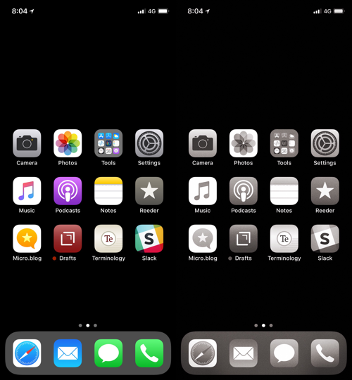
Going grey
Bruce Godin shared a video outlining how our phones are designed to be addictive. One of the ways is the use of colour.
Colours play an important role in our lives, in nature, and we respond to them in pre-programmed ways.
Red is often associated with warnings, danger, a need to take action, so it's unsurprising that notification bubbles are coloured this way.
In the video Tristan Harris, of The Center for Humane Technology, advises switching our displays to greyscale so that everything is more homogenised, less urgent. It's an interesting idea so since last night I'm experimenting with it to see if/how it affects my usage.
On iOS this is done under Settings > General > Accessibility > Dispaly Accommodations > Colour Filters. I've also set up triple-click on side button to easily toggle Colour Filters on and off.
For reading & writing it shouldn't have much of an impact but what about other behaviour?
The first reaction is a strange one - it's almost shock that everything looks so.... lifeless. But, I suppose that's the idea. Everything is reduced in intensity, nothing really stands out. I'm starting to get used to it but it feels strange.
Will it make me less likely to flick between apps now that the lure of their bright colours is neutralised? Though, saying that, I tend to really only use five on a regular basis and that's including Safari.
Comments
# Muscle memory is a blessing and a curse. At work I keep hitting ALT+Q on a Windows keyboard and expect the application I'm in to close.
# One thing I've noticed very quickly about using greyscale is that web page links aren't always obvious if the default underline has been disabled in favour of other styling.
Certain shades of blue almost exactly match normal text when viewed in greyscale. Unless they are highlighted in other ways, like an underline or bold font, they are easily missed.
# I unlock my phone, see the grey icons and don't feel the urge to dive in, I just do what I need and get out without flicking between apps.
I've seen comments that making this change renders the phone "unpalatable" but isn't that kind of the point? It may seem like a bit of a waste of the amazing display but what price sanity?
I don't know if the greyscale thing is actually working or if it's just psychological - perhaps because I know that the phone is supposed to be less enticing I am subconsciously convincing myself that's the case.
I think it's way too early to tell - it probably needs a while to get over the novelty of the situation before I really know if any change in behaviour is genuine or self-induced.
Still, whatever the reason, if it achieves the intended result isn't that all that matters?

@colinwalker I always dump mine very low and slowly move it back up, when I fall off.
@colinwalker I was almost back to where I was in October, before I had to spend a few days at the hospital.
@hjertnes Yeah, I set mine artificially low while I was off sick but over the past couple of months I’ve been more active so let it naturally creep back up. Feels good to be back to where I was.
@colinwalker That’s awesome, congrats!
@EddieHinkle Thanks Eddie. I think it’s more psychological than anything, almost like putting it all behind me.