2022/05/08#p1
The two main goals of (b)log-In, and the custom WordPress theme before it, were to be simple and minimal. Things have certainly become more complex over time but the bulk of additions have been author focused so not impacted too much on the reader.
One area where the impact has been felt is in the display of each day. With the addition of comment and email icons it feels less like a single day flowing down the page. I have been wanting to do something about this for a while but wasn't sure what approach to take.
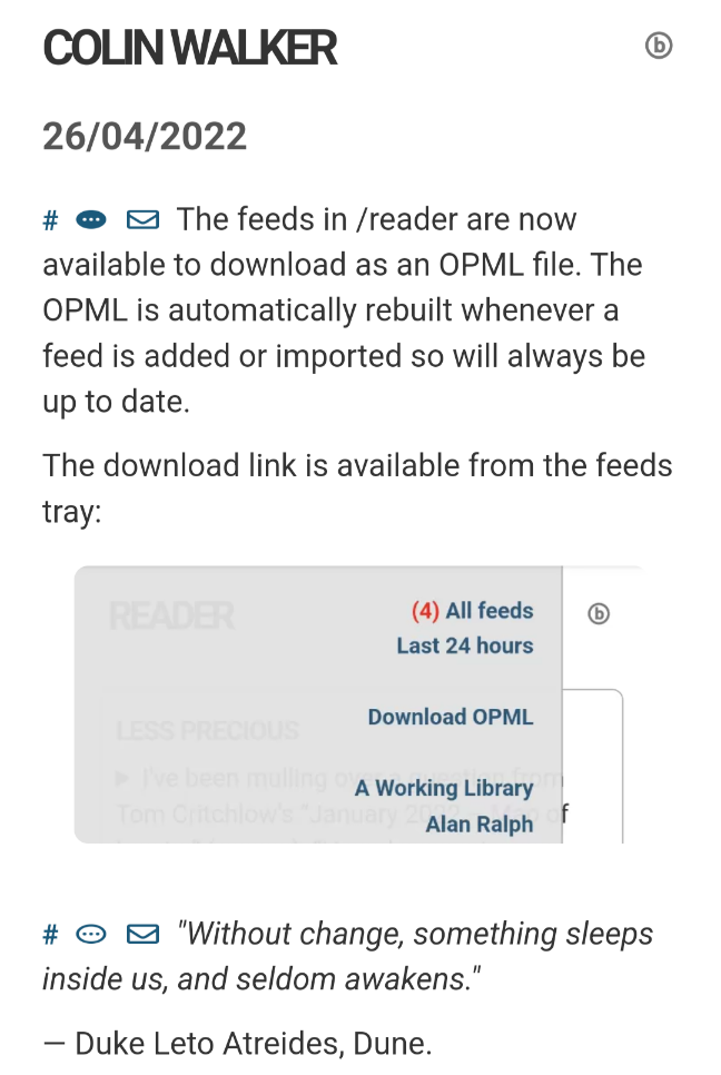
Towards the end of my time using WordPress, and when I first started work on a non-WordPress version of the site, all I had was the '#' preceding each post/section acting as a visual indicator and permalink. This was inspired by Dave Winer's blog. At the time, each day was only a single post divided into sections so there were no comments on each part. Switching to (b)log-In reverted back to having each section as a post in its own right. They could all have comments and the icon was added to indicate this and toggle the Replies area. More recently I have added the icon for 'Reply by email' making things less streamlined:

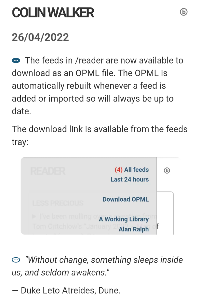
It's not much but I feel it spoils the aesthetic and have taken the first steps to 'fixing' things. Gone is the permalink hash – a big step as that has been part of the blog language for years. I think the comment icon is of greater significance so that will now double as the permalink; I have also moved 'Reply by email' leaving just the one icon at the start of each post:

Much neater.
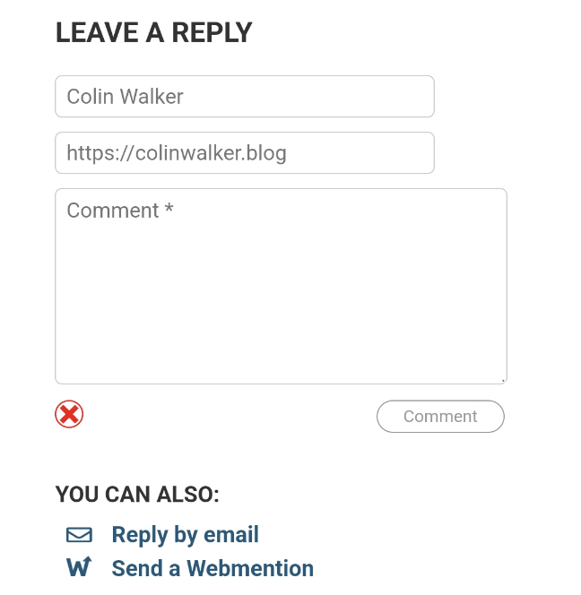
The mail icon is now under the comment form along with the prompt to send a Webmention:

Beyond this, I'm also looking at removing a little bit of the whitespace between posts to get some of the 'full day' feel back. There are occasions when too much space is left (when a post finished with an image or blockquote, for example) where things just need tightening up to make them more consistent.
It's still a work in progress but I believe it's on the right track.


@colinwalker I never cease to be impressed with the platform you've created, Colin. Simple changes but they look great!
You flatter me sir. I'll take it 😂
@colinwalker interesting tweaks Colin, much neater with the one icon at the start. From a reader POV I find the red LIKE to be more distracting than the multiple icons...
The difference here is that the red 'badges' are part of the post content rather than the surrounding architecture. They are supposed to be in your face, visual magnets which will have more purposes over time.
My issue was that the architecture was getting in the way of the experience. It's very much a personal thing.
I've been considering different colours for the badges based on light and dark modes so might play with that at some point but I have some other ideas for the site before I get to that. Thanks for the observation.