2023/03/08#p1
Anyone who has visited this site over its last few iterations will know that for a while, before switching to (b)log-In, each day was a single post divided into sections rather than separate posts. I'm getting drawn back to that idea but wonder if, in reality, it would actually make any difference.
Each section had it's own permalink and was listed separately in the RSS feed. The only real difference was that each section did not have its own comments area.
Thinking on this more I realise that it's not the 'whole day as a post' thing I crave but returning to the blank page metaphor.
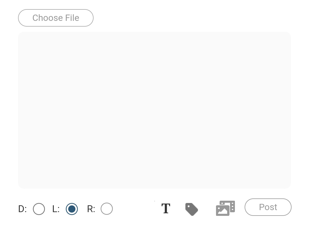
Yes, each day starts anew with no posts to influence or burden me but the posting UI is a textarea that is starting to feel wrong, enclosing, too restrictive.
I do most of my blogging (most of most things) on my phone so my design is very influenced by the capabilities of the slab of glass in my hand; it is a 'mobile first' environment. The aforementioned textarea covers only around a third of the screen as I accommodate the on-screen keyboard and rest of the posting UI (buttons etc.) That's something I probably need to get away from but convenience usually trumps utility.
The posting process is quick and easy but is starting to feel, well, cluttered. I think that's the only way I can describe it. More options have been added over time and it has all started to feel awkward.
There's that word again: feel.
It's funny how a bunch of pixels on a screen, just a box and a few buttons, can elicit an emotional response. But is does. Especially as that bunch of pixels makes up the interface through which I share my thoughts with the world.
I can sense a redesign coming on.
I'm considering a more simplified UI, making virtually the whole screen the writing interface – no visible borders and minimal controls. Those less frequently used will be gated behind some kind of toggle or menu, only visible when I choose to make them so.
The write.as site is a good example of the sort of environment I'm imagining. A clean, open space with no distractions that grows as needed as though writing on an endless page rather than in a box.
Typing into a box, no matter how easy, seems to artificially constrain the thought processes, makes me more likely to publish a short post. I'm typing this on my /notes page which has less going on, especially as I can choose to only display the current item. It feels easier to express myself here and then publish it to the blog (that's just a different button using a formaction value.)
It may sound like I'm blaming my tools when the issue is more likely with myself, but I also need my posting UI to get out of the way so that the words can flow again.


