# In reply to: ...
There's a certain irony that with the open technology of the indieweb the conversation is relatively closed - at least in the first instance.
I don't use the big silos any more so don't syndicate my content beyond micro.blog which closes avenues of comment.
I also disabled native WordPress comments a long time ago as I didn't want the hassle of moderating them locally. I had previously outsourced comments to Medium but stopped cross-posting there.
In a sense micro.blog acts as a comment platform but two-way - others can "comment" on my posts at the same time I can "comment" on theirs via the same social interface. It's actually quite an elegant solution but, for the time being at least, relatively closed.
Part of that is because it is still in beta, with the artificially restricted population that goes with the territory. Another part is that it needs people to have their own blogs (either self-hosted or on micro.blog) but also because it relies on technology that does not, and may never, have widespread adoption despite being a W3C recommendation - webmentions.
So it all comes with a degree of compromise.
We either have to make sacrifices with our behaviour (syndicate to places we may not want to) or limit the avenues of reply.
As I have said in the past, ownership in a wider context encourages greater civility as we are more directly connected to our words. Not always but it's certainly more likely. Unfortunately, most will not follow this path because of the relatively frictionless experience of using the social networks.
We are a long way from an indieweb utopia, and things will have to get radically simpler before we could ever entertain one, but we can keep chipping away at the edges in the hope that more adopt even some of the principles and technology.
Comments
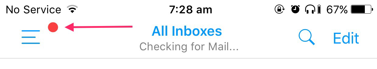
# This red dot appeared in Edison Mail yesterday and I have no reason why.
Comments
Liked: Embrace the Notch! | Infinite Diaries â Technology, Photography & Travel...
Most seem to prefer the idea of blending the camera/sensor/speaker "notch" with the status bar but I agree that not doing so (even if the status bar icons are still either side) could better emphasise the screen size.I certainly wouldn't be against it and don't think it's as ugly as many are making it out to be.
What's potentially more worrying for me is how the "utility area" is handled at the bottom of the screen.
Currently using the Plus I am used to a 5.5 inch screen area. If the talk of the 8/Pro/whatever having a "usable" screen area of 5.15 inches is correct (and it looks like it is) then I will be losing space rather than gaining it depending on how the utility area is handled.
It's supposed to be hidden in certain apps (like when watching video) but what about in others?
If we have a virtual home button under the screen do we actually need a visual representation of a physical button occupying so much space at the bottom of the screen?

Something I like: 03/08/2017, 05:55 – Social Thoughts… Colin Walker highlights that the ownership and authenticity involved with blogging on the indieweb comes with an important tradeoff – simplicity. The major social networks provided great simplicity, but ownership and authenticity is quickly lost.
<em>Related</em>