Scroll to top

07/01/2022


2022/01/07#p1

0 comments: click to leave a comment

Last night I installed the Android 12/One Ui 4.0 update on my phone and was instantly left with the same feeling as after the Android 11/One UI 3.0 update – meh!

The headline feature in Android 12, Material You, provides insipid colour choices which are only applied to part of the UI leaving a mismatched, jarring appearance so it's better to leave it turned off. Samsung also haven't been as bold as Google with new widget options, not that I use widgets much so this probably wouldn't affect me anyway.

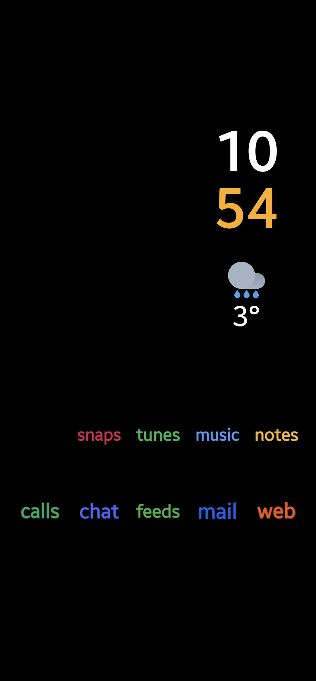
I'm not one for advocating change for change's sake but my phone looks and feels exactly the same as it did before the update. Some might like that as it saves having to learn/unlearn things but, after another major increment in both Android and One UI versions, I find it distinctly uninspiring.

No comments yet
Leave a reply


You can also:

Click here to reply using email Reply by email Send a webmention Send a Webmention


avatar
Guy says: Reply to Guy

@colinwalker what launcher do you use?

avatar
Colin Walker replied:

It's the standard One UI launcher. I'm using an app called Shortcut Maker to create the text icons, weawow for the weather widget, and Digital Clock Widget for the time.

avatar
Guy says: Reply to Guy

@colinwalker cool, thanks!

Leave a reply


You can also:

Click here to reply using email Reply by email Send a webmention Send a Webmention


No comments yet
Leave a reply


You can also:

Click here to reply using email Reply by email Send a webmention Send a Webmention


avatar
stevebrady says: Reply to stevebrady

@colinwalker Timely as I am rethinking my approach to social media right now too.

avatar
Colin Walker replied:

It seems a lot of people are.

Leave a reply


You can also:

Click here to reply using email Reply by email Send a webmention Send a Webmention


Close